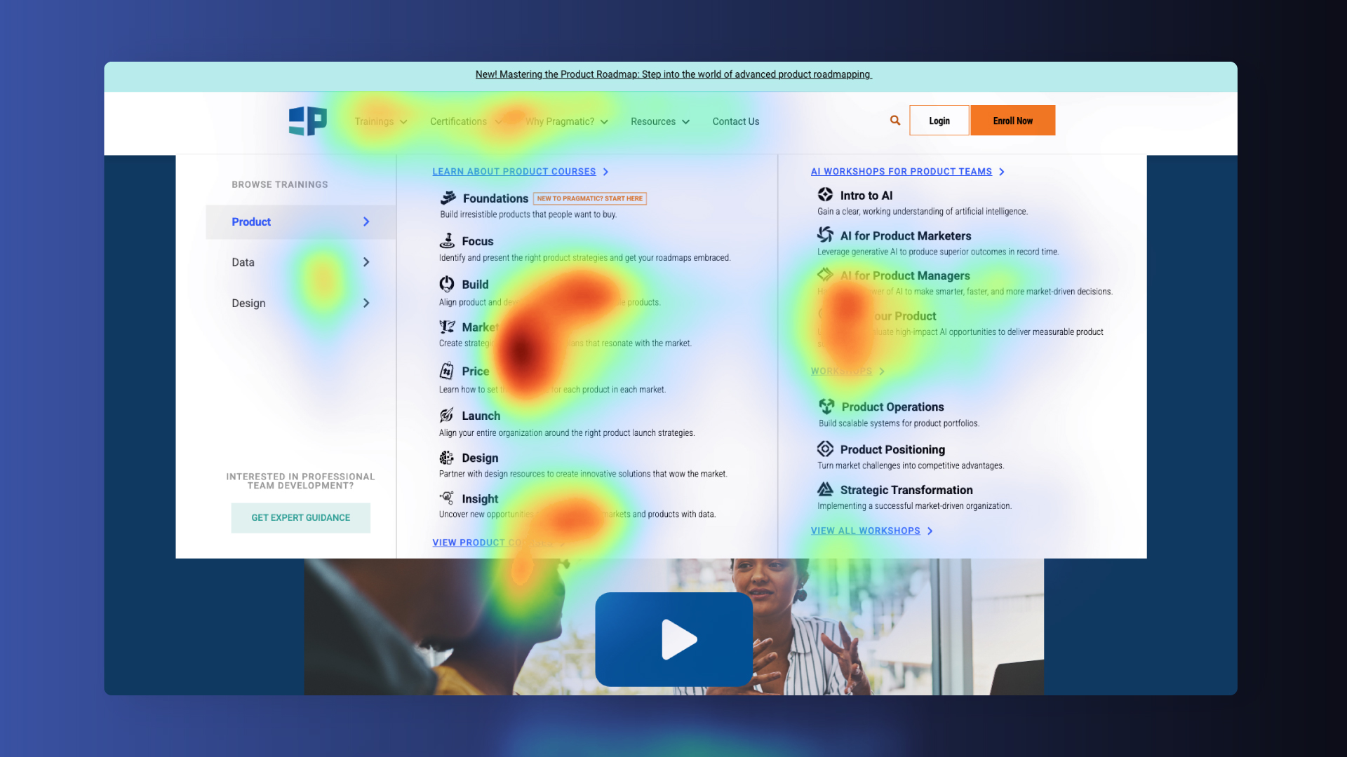
The site’s existing navigation was cluttered, inconsistent, and difficult for users to scan. Analytic data and heatmaps revealed that key content was hard to find, while less important items received disproportionate attention. Overall usability and discoverability were low, creating friction in the user journey.
Our Solution
I developed a new information architecture, refined labeling, and tested simplified flows to align the navigation with user needs and business priorities.
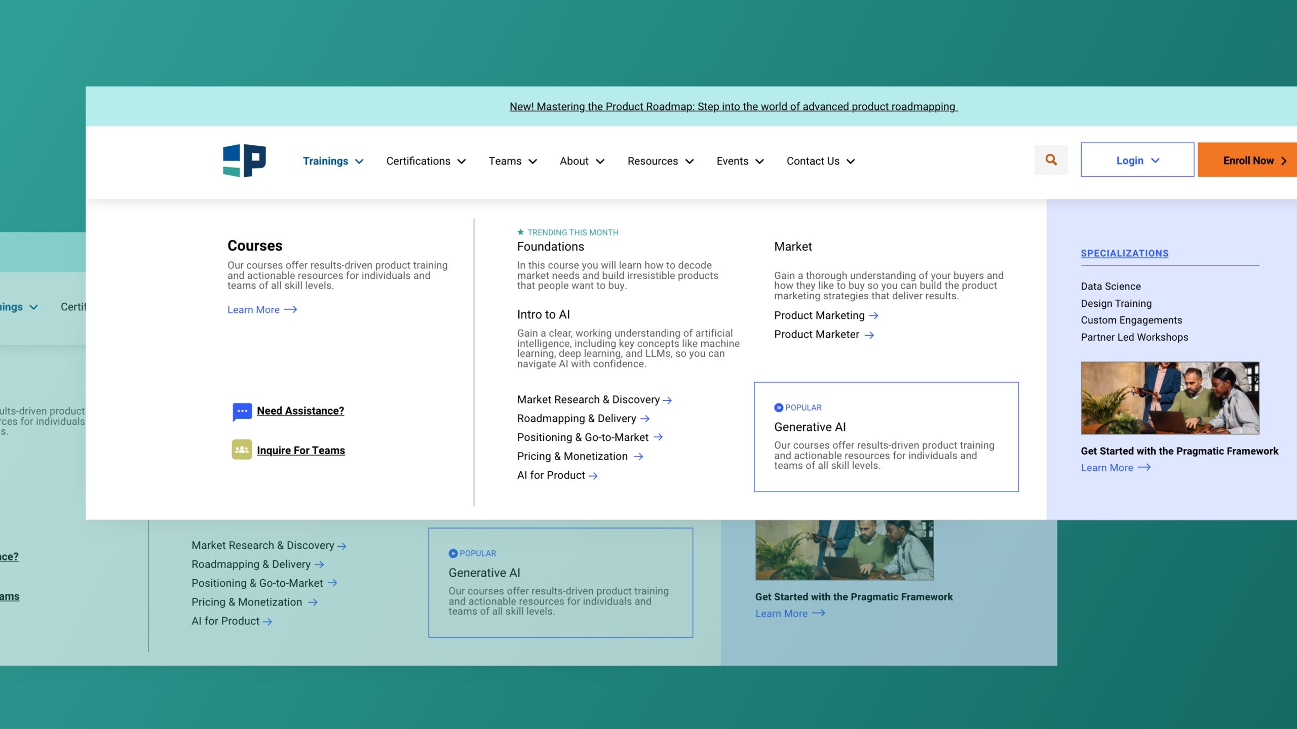
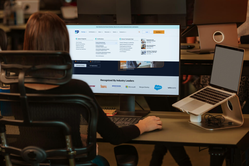
The navigation menu redesign emphasizes clarity, usability, and goal-driven navigation. Key pages such as Foundations, the Product Mangement Homepage and Product Management Certification pages are now accessible in fewer clicks, providing a more intuitive and efficient user experience.
User Behavior Analysis
Heatmap data revealed that users heavily interacted with a few high-priority links while ignoring large sections of the menu. Items placed deeper in dropdowns saw minimal engagement, indicating poor discoverability and overall usability challenges.
Process & Key Steps
Step 1 – Audit & Discovery Reviewed analytics, user recordings, and stakeholder input to understand how the menu need to be evolved and what business goals it currently supported.
Step 2 – Information Architecture Mapping Documented current hierarchy and identified redundant or overlapping categories.
Step 3 – User Testing & Validation Conducted card sorting study and quick usability tests to evaluate label clarity and logical grouping.
Step 4 – Strategic Refinement Developed new design that emphasized clarity, reduced depth, and prioritized frequently accessed content.
Creating a Simplified Navigation Structure
Building on the insights from the audit the new menu was designed to simplify hierarchy, clarify language, and prioritize top user goals. Key pages, such as the Product Homepage and Product Management Certification, are now surfaced in fewer clicks, helping learners reach important content faster.
Content is grouped by user intent rather than internal teams, improving clarity, scalability, and alignment with actual user needs. The result is a cleaner, more intuitive navigation system that supports both usability and future growth.
Outcome & Impact
Usability sessions showed faster task completion and reduced hesitation when exploring the new menu. The updated structure also created a clear content framework that marketing and development teams could easily extend.
Key highlights:
Discoverability of AI and similar certifications jumped 10%
Clicks to certifications increased by 25%. Refresh of certification page that lead with the value proportions also increased click-through-rate by 15%.
This project demonstrated how small adjustments in information architecture can have a large impact on usability. Clear, data-informed decisions transformed a cluttered navigation into a structured experience that helps users find what they need faster.