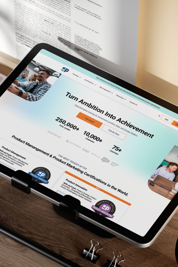
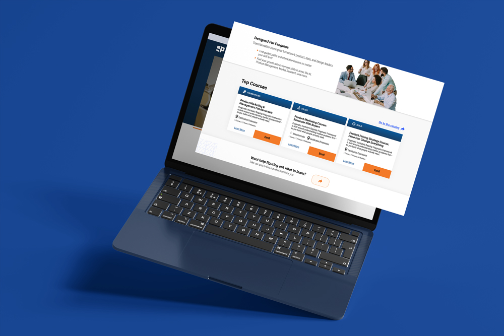
As Pragmatic Institute expanded its online learning ecosystem, the web experience had become fragmented and inconsistent. Key landing pages lacked a clear content hierarchy and effective calls to action, while the mobile checkout process created friction for users trying to register or purchase courses. These issues led to lower engagement, increased drop-offs, and an overall experience that didn’t reflect the quality or credibility of the brand.
Our Solution
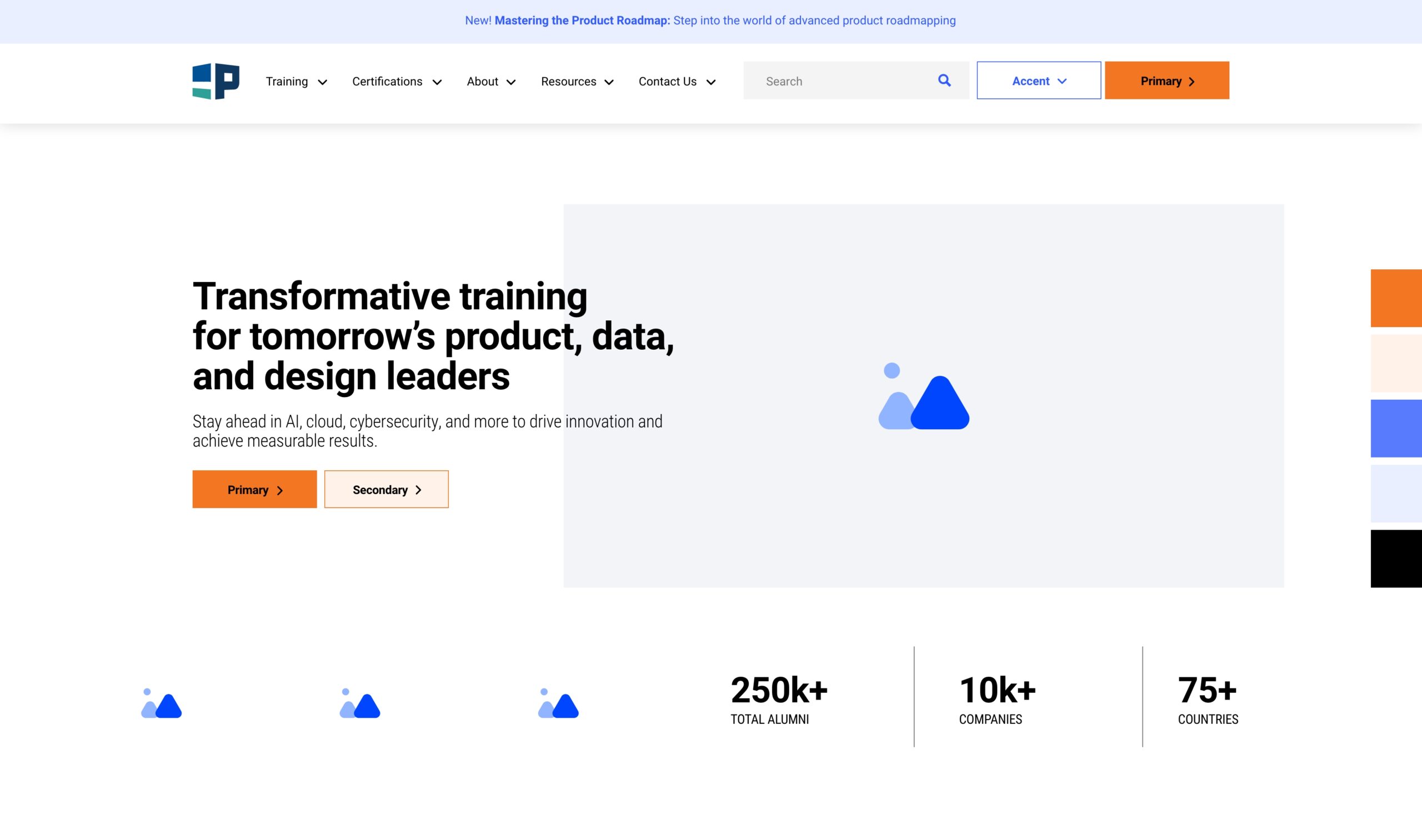
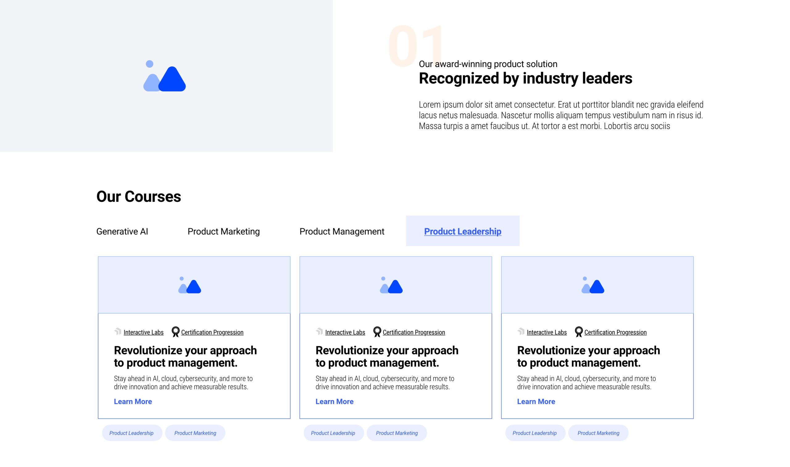
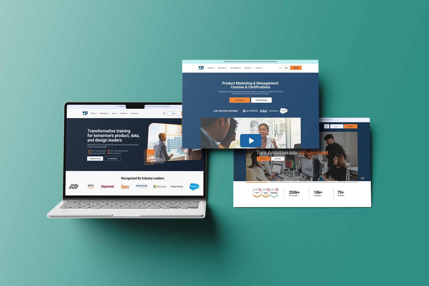
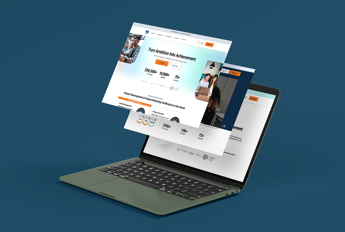
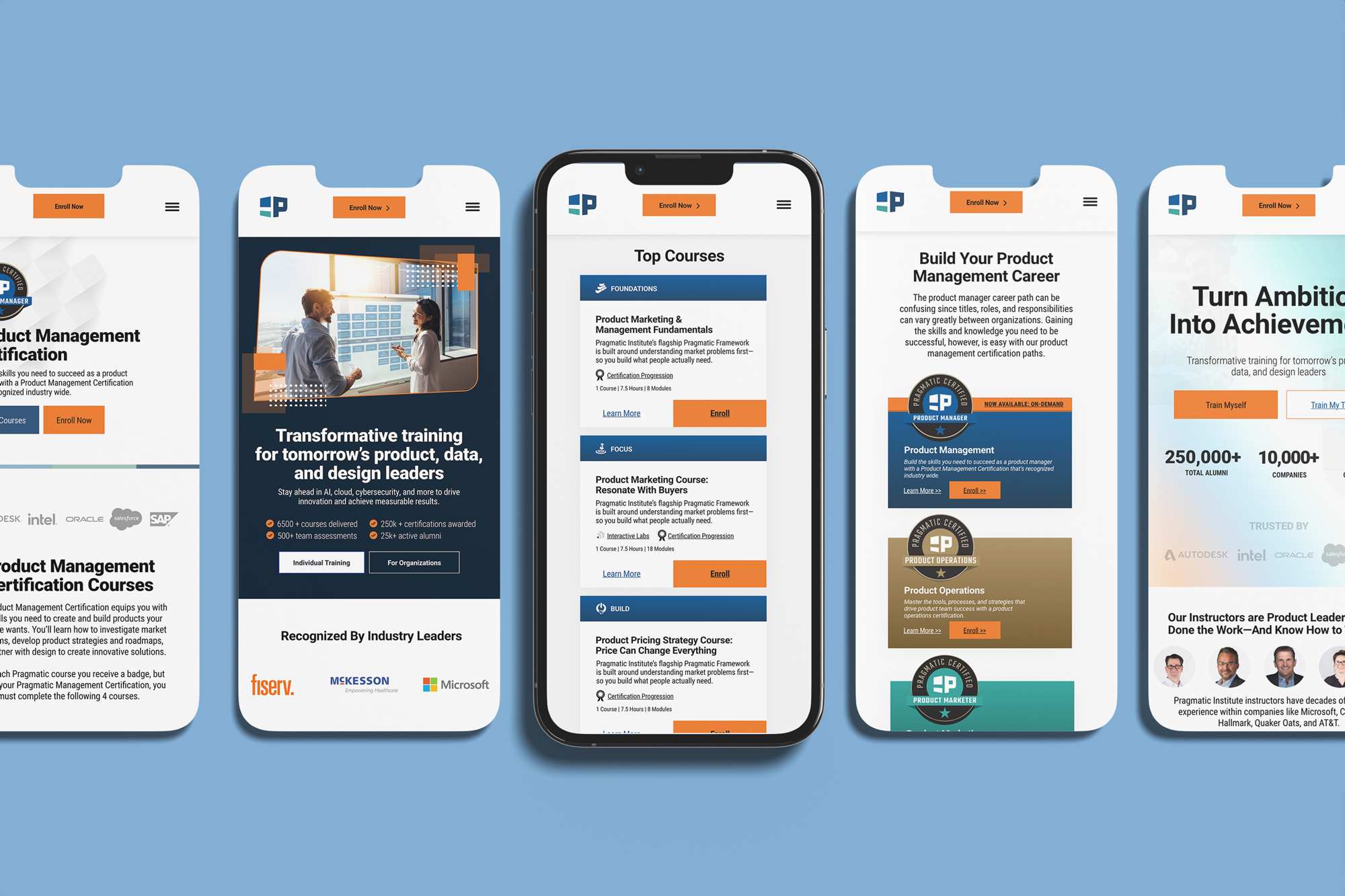
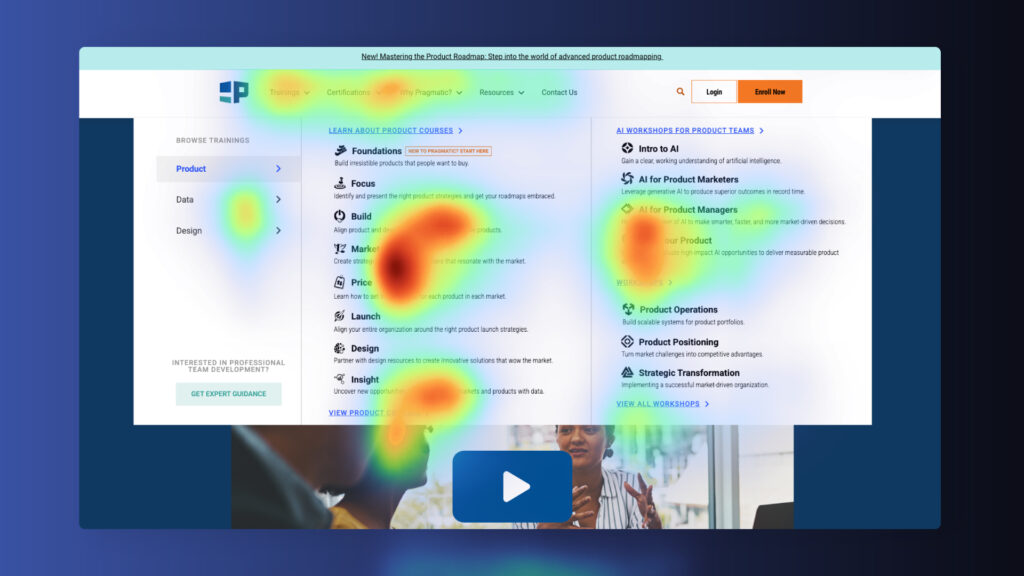
The first phase focused on modernizing high-traffic landing pages to improve usability and engagement. I refined visual hierarchy, strengthened CTA placement, and optimized page layouts to guide users toward key actions more effectively. These updates not only improved engagement time but also established a consistent design system that reinforced the Pragmatic brand across all digital touch-points.
In parallel, I redesigned the mobile checkout experience to address usability and performance pain points. The flow was simplified, forms were optimized for smaller screens, and visual clarity was enhanced to reduce drop-off during the purchase process. Together, these improvements created a cohesive and efficient user journey.
Building the site
The web pages were rebuilt using Elementor Pro, implementing modular and responsive layouts optimized for performance and scalability. UX/UI best practices were applied to improve content hierarchy, visual balance, and accessibility compliance (WCAG standards). Global design components, custom widgets, and reusable section templates were developed to ensure consistency across all pages. Interior pages were updated to align with the new design system, streamline navigation, and create a unified user flow that directs traffic efficiently toward key conversion points. Performance optimizations, including image compression, lazy loading, and clean CSS structure, were also implemented to improve page speed and overall site stability.
Site Performance: Measurable Impact
Following the redesign, key performance indicators showed results well above expectations: total sessions increased to 85,000 per month, session engagement time rose to 1m48s (up from 45s), and bounce rates dropped by 6%. These improvements demonstrate that the updated visual hierarchy, navigation, and content structure successfully enhanced usability, user engagement, and overall site effectiveness.
The web pages were rebuilt using Elementor Pro, implementing modular and responsive layouts optimized for performance and scalability. UX/UI best practices were applied to improve content hierarchy, visual balance, and accessibility compliance (WCAG standards). Global design components, custom widgets, and reusable section templates were developed to ensure consistency across all pages. Interior pages were updated to align with the new design system, streamline navigation, and create a unified user flow that directs traffic efficiently toward key conversion points. Performance optimizations, including image compression, lazy loading, and clean CSS structure, were also implemented to improve page speed and overall site stability.
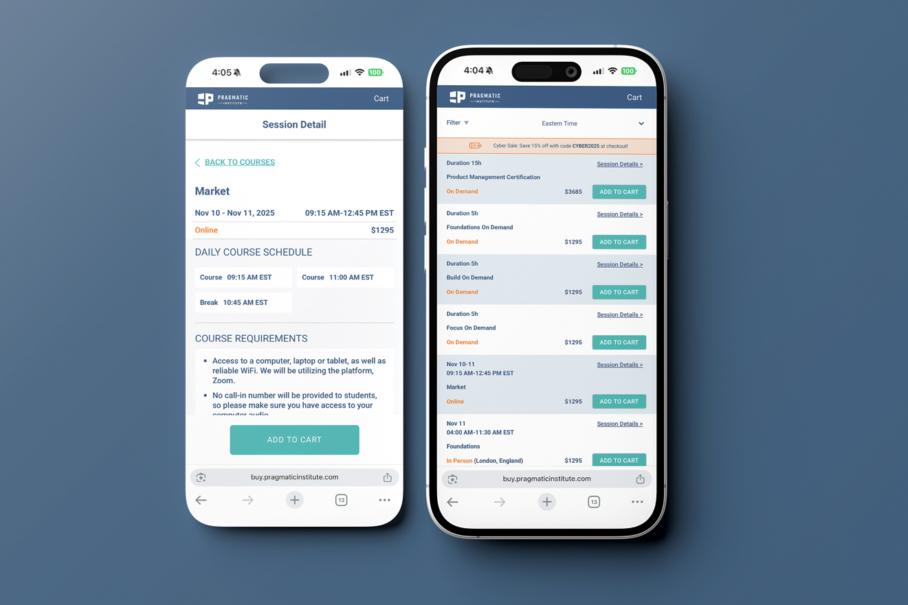
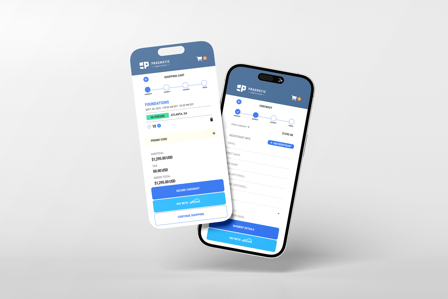
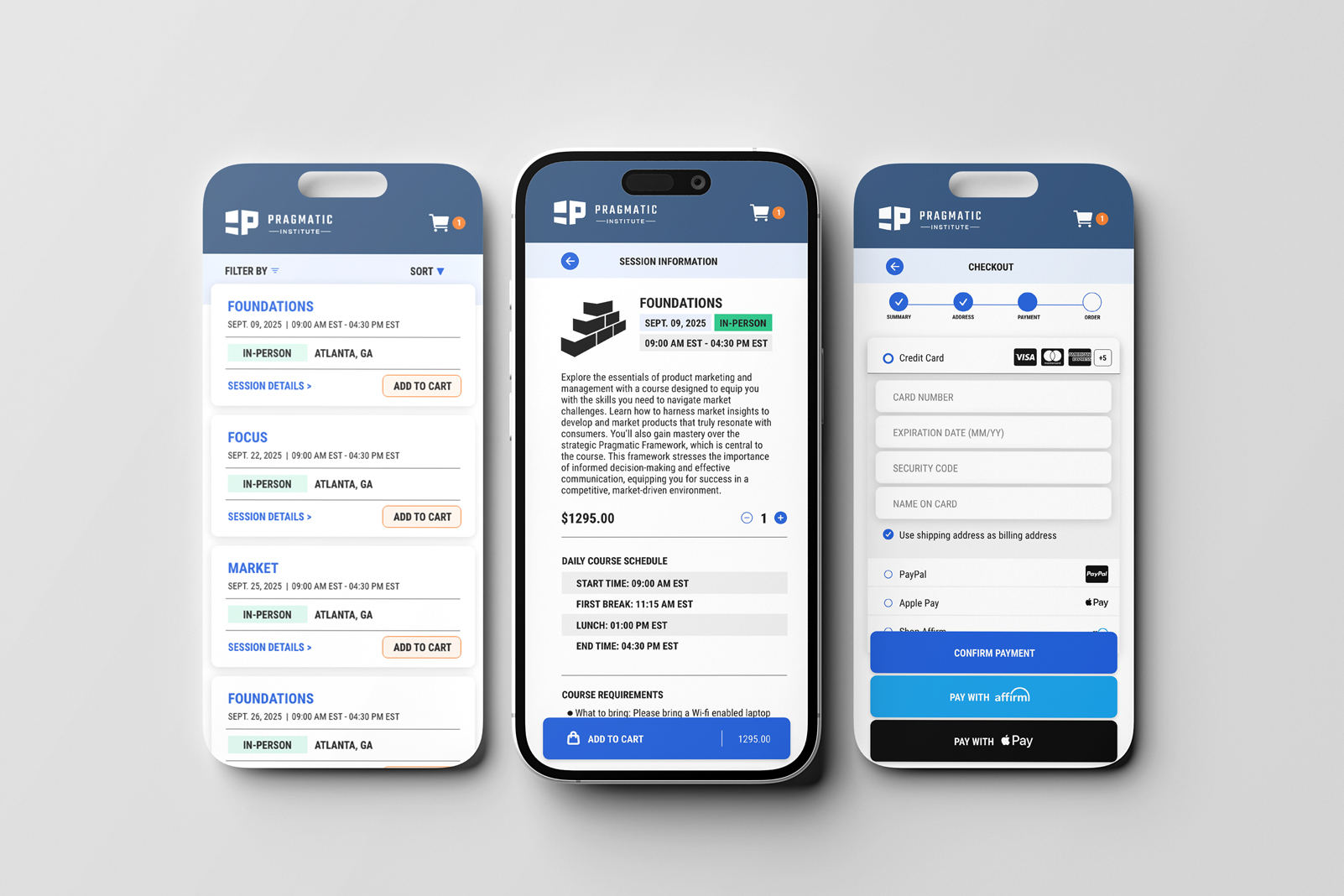
The Buying Experience
Streamlined Checkout
Included Progress Indicators
Simplified Form Fields
New Brand System
The Problem
Usability testing and analytics revealed significant friction within the mobile cart experience. Key pain points included unclear progress indicators, cluttered browsing, and inconsistent visual hierarchy. Many users struggled to move smoothly from course selection to checkout, often abandoning the process before completing their purchase—or even reaching the checkout stage. This led to reduced conversion rates and frequent negative feedback from mobile visitors.
BEFORE
The Approach
I set out to simplify and modernize the mobile checkout experience, focusing on clarity, flow, and ease of use. The redesign prioritized reducing cognitive load, strengthening visual hierarchy, and aligning interactions with mobile UX/UI best practices. By streamlining navigation, refining form layouts, and creating clearer progress indicators, we transformed a once-frustrating process into a guided, intuitive experience.
The updated design introduced a cleaner interface with stronger contrast, simplified steps, and more prominent CTAs—helping users move confidently from course selection to purchase. The result is a mobile checkout that feels cohesive, trustworthy, and built for conversion.
Mobile Checkout: Scalable Design for Future Launch
The redesigned mobile checkout experience has been handed off for implementation, with comprehensive design documentation and component specifications. While execution is pending, the concept establishes a scalable, brand-aligned eCommerce foundation ready to evolve with future business and user needs.


